Friday 23 November 2012

The Psychological Makeup of an Image


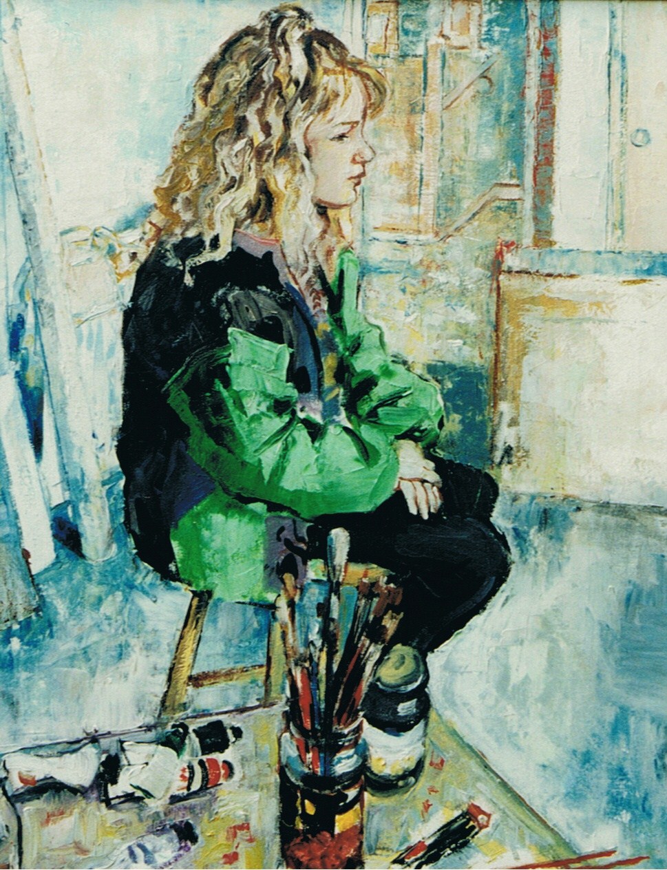
As with any painting, whether it be a figurative one such as this, or one that is purely abstract there is an intense psychology at work. After I painted the head and shoulders of this young teenage girl I was so taken by how I had managed to capture the look of complete vacancy on he face, and the rather despondent way her head hung forward and down, I had to see how I would tackle the rest of her. To enlarge the composition on iPad is quite easy. You post the original to your photos then post it back onto another sheet of paper in your app, which in this case is ArtRage. You can then manipulate the original drawing to whatever size you want, within the picture plane. Here for example, is the original.


Next, the same image positioned onto a new sheet of paper.


From here it is just a matter of continuing the drawing. Although if you add another layer you can erase whatever you add to the picture without erasing the original, which makes mopping up any mistakes so much easier. Now, I don't know if you would agree with me but once I had completed the image it seemed to me that the empty space on the left added to the sense of isolation the girl in the picture appeared to be feeling. If indeed, that is what she is feeling. Although there is a way of testing this, and that is by adding another figure to see if it helps or hinders. However, to do this I first had to save the image then copy it, without posting it again to my photos.

The next image; half drawn, shows a young man wearing sunglasses. I had drawn in his eyes originally, but couldn't quite get the look on his face that I wanted. He began to look incongruous... Baring no relationship whatsoever to the girl. So I gave him a pair of very dark sunglasses to hide his feelings towards her: which is a cop out I admit, but by then I was beginning to realise I should have gone with my initial thoughts on the matter. Adding another person somehow trivialises the image, and turns it into a joke. I can almost hear him say, "So what do you make of my new shades?"


 Then again, maybe he is just a badly drawn boy. Maybe if I had made the effort I could have added something more: to provide some sort of message. To make something of a statement about human relationships for instance. It is difficult to say for sure, and why I always go with my gut feelings when it comes down to the psychology of picture making. The more uncertain your feelings are towards the girl; from an artistic point of view at least, the better. Why spell everything out?

Thursday 22 November 2012

Landscape Painting on iPad


This image was painted from memory of my time in Cumbria, the English lake district. The mountain range in this region was carved away during the last ice age. So the valleys have quite steep slopes and cliffs either side owing to the action of glaciers. Although the fells are not all that high they are very rugged, and covered for the large part in trees. In fact from the road the trees tend to block your view as you can see.

By contrast the place where I live in Lancashire is very flat. On the boundary of Chat moss: an ancient peat bog that was drained much later for farming purposes. In fact I live by the biggest drain of all, the Manchester Ship canal that runs from Liverpool to Manchester. However, there are not any high vantage points to view the moss from so the image below is a bird's eye view which I did entirely from imagination. The mountain in the distance on the far right is known as Winter Hill.


On the other hand, this tiny enclave is a part of Chat moss that is easy to miss from the road, and leads directly to the farms. As you can see it is painted in a more realistic fashion taken from a photograph.


Moving westward into Wales the next image is of the Vale of Llangollen painted again from memory and imagination.


Again, the following is my impression a typical Welsh valley that I did in the context of a thumbnail sketch, hence the rather rapid strokes which I prefer because they activate the surface and animate the composition more.


In a more fanciful fashion this next one could be almost anywhere in the world, but reminds me again of being on the slopes of the Lakeland fells. Except that the colours make it look rather more exotic.


Overlooking the Mersey estuary is the lovely village of Frodsham. This is painted from memory of the escarpment above the village, which I did in watercolour on my iPad.


Another watercolour, of a field with trees, which again, could be the backdrop to any rural setting.


In the next image I got a little carried away with creating a textured surface to evoke the sense of a mid, to late twentieth century modernist style of painting. To be honest with you I love this way of working because it is so much more adventurous.


In fact, here again in the following two images I expand on this modernist approach to produce something equally exotic and stimulating on the eye. Albeit, a little less frenetic in character.


I shall finish with two more images that were intended for illustration purposes only. One is of a grave yard overlooking a valley in autumn just as the leaves are falling, and the second of the Grand Canyon in America which I have never visited, but have always wanted to. Although because of the bright primary colours it does tend to look like a backdrop to a Walt Disney cartoon.


Figure Painting on iPad


What I particularly love about painting on my iPad is that when it comes to painting the human figure from memory and imagination I can work with such speed, and am able to erase my mistakes so easily. The layering process on my app, ArtRage, also makes it possible to create irregular patterns of such complexity they can bring a simple drawing to life in an instant. This image of a rather awkward looking teenager came about entirely by accident. I tend to throw down a few simple lines in pencil with a vague idea of a figure in mind, then try to visualise what that person might be doing. If I cannot see anything of interest I erase and start again. This happens on a regular basis and why, with iPad I don't need to have any concern about the amount of paper I am going through. However, because I can create such variation on this devise I am prone to change my approach with each image, and can so easily loose any sense of consistency. Here are two more examples to show you what I mean.


I did all three of these last night, and as you can see they have absolutely nothing in common; subject wise at least, though the background is familiar. I have to admit I do get bored with repeating myself. Although I am slowly developing a formula, and maybe in time will find what I am looking for. Until then I shall continue to entertain you with my thoughts and images.

Tuesday 20 November 2012

Figure Painting on iPad


I love painting the human figure from memory because it really tests your skill and knowledge of anatomy to the limit. I don't begin with anyone in particular in mind, or vision of how they will appear when I have finished. I just start drawing and then add colour. Sometimes I begin with a quick outline in pencil, or in silhouette. Such as if I am wanting to capture the figure(s) in a certain pose. Here are three examples of what I mean...


And so on... Although they finish up more as characterizations than of real figures for this reason. To my eye at least, they appear more animated and alive. Unless that is, I am copying a figure from a photograph, or from direct observation. If not, then I avoid trying to be too precise for fear of overworking the painting. The image below is one exception, in which I was trying to capture a figure of a young dancer in a typical Degas like fashion: posing with her head held back and eyes closed as if resting, or contemplating her previous movements. In this case therefore, I wanted her to be as life like as I could make her, which was difficult but not impossible.


Monday 19 November 2012

Portrait of Lucy. Oils (1992)


Lucy is the daughter of a neighbour of mine. Although she was only about nine, or possibly ten years old when I painted this she is taller than me now. I was taken with her very pretty eyes and long blond locks held back with a small ribbon. I just had to paint her, and asked her to sit for me.

Because my studio is rather small, my intention was to execute the painting looking through a large mirror I had on the wall. To give me more space to position my easel without blocking my view of her. However, I soon realised this was not going to be as easy as I had imagined. As I turned towards the mirror I discovered there was nowhere to plant my large studio easel without it getting in the way. It was then that I turned to face Lucy and discovered she has positioned herself on the tall wooden stool looking directly out of the window at the view. It was perfect. "Stay just like that Lucy," I said, "and stay perfectly still." In fact she did. She never flinched a muscle and in about three hours I had completed it... with a short break in between of course.

Lymm in Cheshire. Pastel on Paper. (1986)


This was a painting in pastel I sold recently to an old school friend of mine who now lives in London. It was a cold, but beautifully clear Boxing day and very calm, when I decided to pack my equipment in the car and look around for something to paint. I had Lymm in mind because it is an attractive village close to home. So I didn't have far to travel. Although I wasn't quite sure what I was looking for other than to capture something of the buildings close to the Bridgewater canal. I couldn't find anywhere to position my easel without causing a problem for people shopping and of course having to paint the road with all of its traffic, which tends to be quite bad for such a small village so far from the motorway, and with only one major road running close by. Then again, it was Boxing day, and most people would be still at home. I found this spot to work, which has a broad pavement leaving plenty of room for people to pass without bumping into me. The stream over which the buildings are perched is in a gully, and because it is narrow you cannot see it from here. Nevertheless, I had a good view of the buildings if only from the back. It took me two long days to complete and is quite large for a pastel painting.

Self Portrait in Oils (1984)


This self portrait was not created on iPad. It's for real. A painting I did when in my mid-thirties, in oils. I was; and still am to a degree, influence by the impressionists. Although Cezanne made more of an impression on me than anyone at the time, hence the planes of colour on my face with which I was attempting to model my features... Or should that be modulate? I still cannot understand what he meant by that exactly, but the planes of complementary colours do appear to provide a more chiseled appearance to my face. Accentuating my cheek bones and rather large nose. Not that I could produce anything quite so exotic as Cezanne; or ever hope to match his style, but then I put this down to the fact that I was still trying to hone my technique. To produce something that was more unique to me.

Saturday 17 November 2012

Abstract Painting on iPad


I love working in the modern abstract style. Essentially for the fact that I can work with great speed on iPad, even though it takes me a good half hour or more to complete each painting. The reason for this is down to the fact that I am experimenting with fresh new ideas, and am having to feel my way along. I enjoy coming across those happy chance finds that take the work in a completely different direction every few minutes or so. The image above is a landscape with two rather exotic looking trees in it. Although it was not my initial intention to create a landscape, as I progress I sometimes begin to see shapes that have something a passing resemblance to what I have seen in nature. The following images are four more that I did today.


Friday 16 November 2012

Video of some of my other work on iPad


My paintings on iPad are very experimental, and although nearly all the work you see on this video is abstract I am merely exploring what can be achieved using my app, 'ArtRage.' By playing with the tools I have learned so much, both technically and stylistically. Sufficiently enough that is, to use this knowledge to advance my studio work... The paintings I am working on in reality.


Tuesday 13 November 2012

Portrait of Gandalf on iPad


I painted this after seeing a photograph of Ian McKellen dressed as Gandalf in 'The Hobbit.' However, rather than attempt to copy it from the photograph I decided to turn him around. To see him in profile.


Stage 1

The intention was to reduce the general hues and tones to a minimum without making it look too schematic. Although I began him in silhouette using the watercolour brush on ArtRage, and only in black because I find it the easiest way to capture the outline of the figure.


Stage 2

With the Eraser I then cut into this to arrive at a more satisfactory outline. Then tried to capture something of a likeness to McKellen's features, with his beard. Not that it looks anything like him but that didn't particularly concern me.


Stage 3

At this stage I decided to change the colour of the background and add a few splashes of light pink to it, to lift out the figure.


Stage 4

As I went to full completion I decided to throw in a few zig zag lines in black. I don't know why, but it seemed to work for some unearthly reason.


Sunday 11 November 2012

Portrait of Cate Blanchett on iPad


The problem with painting a beautiful woman from a photograph such as the one you see here of Cate Blanchett, is the same as with painting a small child. Their features often lack sufficient character; like you would see on a man or an older woman, to enable you to give their faces any depth. Although thankfully, the photographer who took the image I copied the actor's face from provided her with plenty of shadow. Sufficient that is, to highlight her high cheekbones and firm, broad nose. Both of which would have probably been lost had he flooded her face with too much light.

Stage 1

I began the portrait by blocking in the colours to establish the form of her head and position her eyes, nose, and mouth in their correct places. Her left ear on the other hand, began to look too prominent since she had lifted her hair above her head to expose her ear fully, which would have stood out even more against the white background once I had painted it in.

Stage 2

As I continued to blend the colours and fill in the details it soon became clear to me that the white background had to go: which was easy enough to change by using the paint pot and simply touching the surface of the iPad with my stylus.


 Stage 3

It was at this stage however, that I made a mistake. Just as I was eliminating the peculiar looking shapes  above her forehead; to replace them with more natural looking hair, I touched the surface with my stylus whilst still using the paint pot. Her ear, as you can see from the image below all but disappeared, and the background colour merged with the shadows on her face. This I liked, and decided to continue on rather than correct my mistake.


Stage 4

The final stage involved painting in part of her neck and softening the lines of her hair while lightening the background again, and working on the face a little more.


I am pleased with the result because it appears now that her face is emerging from the background. Thrusting it forwards rather than having to darken the shadows on her face merely to give her head more form. Besides which, it saved me the task of filling in all the other details, and probably overworking the image.

Saturday 10 November 2012

Portrait of a Basset Hound on iPad.


This is a portrait of a basset hound I copied from a book. A book I have, amongst several others for reference purposes. The object of the exercise in this instance, was to assess how close the pastel tool on ArtRage was to that of actual pastel. Having used this medium in the past on many a portrait. To my amazement it not only matched pastel in terms of texture, but with the aid of the palette knife it also blended with other colours in just the same way had I used my fingers.

Although you can paint with your fingers on iPad it is not touch sensitive. You have to rely on the tools available on your app to achieve what you want.

The first stage is relatively advanced because I didn't think of keeping a record during the initial development. Nevertheless I began by blocking in the colours, making sure I had the position of the eyes and general shape of the dog's jaw and teeth just right in relationship with the rest of its head.


The next stage I sharpened up the details and added a few whiskers to his nose.


In the third stage I decided to remove the rather bright yellow patch of fur from under his jaw, and added some pastel to the background.


The final stage involved adding a line of bright hairs just beneath his chin and lightening the colour of the background paper slightly.


ArtRage has a good selection of papers on it's app, along with various canvases of different texture.


Thursday 8 November 2012

Self Portrait on iPad


I bought an iPad in March of this year and was all fingers and thumbs to begin with. In fact my fingers and thumbs were all I had to work with until I invested in a stylus. However, finding the right stylus is something else. The first two I bought had soft rubber tips which after a month or so tore, but then they were cheap enough to buy, and if I could lighten my touch rather than using it like a pencil or brush maybe I wouldn't go through quite so many. The sensible thing of course, would be to buy a more expensive one such as the Nomad brush stylus which is what I shall do once I have the cash.

There is one other thing before I begin, and that is that the iPad doesn't quite work so well outside, especially in bright sunlight. Unless that is, you buy an anti-glare screen to put over the surface to reduce the reflections. Failing this it is almost impossible to see what you are doing.

The app I use is called ArtRage, which is a superb app but a little prone to freezing up on you once in a while. So it is wise to save your work as you go along. The way around this problem is to reboot your iPad occasionally, which is very easy to do. In fact, I reboot mine everyday.

When you start a new painting on ArtRage it looks like this...


All the tools you require are on the left, ranging from a paint pot down to an oil painting brush, and the colour wheel is on the right. In fact, it couldn't be more obvious and easy to use. Although it took me a good six months to master to be honest with you. The trick I found was to play with the different tools by doodling with them, and then the different layers which are really fun to use. The result of all this play is as you can see below. A self portrait I did looking through a mirror, which I achieved by first sketching it out using the pencil and a little pastel on a layer which overlapped another. The layer below being a pattern I made using the technical pen. All I had to do then was to erase the layer my drawing was on being careful not to erase the drawing itself, which allows the layer below to grin through.

First layer.

 Second layer.


At this stage you erase the background of the second layer to reveal the layer beneath.


In the final stage I strengthened the drawing while altering the background colours to match. In parts I smoothed the pattern out with the palette knife to soften it.


Altering the colours is very easy when using the paint pot. All you have to do is touch the surface of the iPad with your stylus after choosing the colour you want. The change is immediate and if it doesn't live up to expectations you can reverse it just as easily.